Saturday, April 28, 2012

Essie Brooch the Subject + Shine of the Times

Essie Brooch the Subject was released as a part of Essie's Cocktail Bling collection for Winter 2011, and Shine of the Times is part of the Luxeffects collection released at the same time.


Brooch the Subject is a nude creme. I'm so clueless about nudes that I don't really know how to describe it, haha. This did photograph more yellow than it is IRL though.


It's almost opaque in 2 coats, but there were some uneven patches so it definitely needed the third. Just a note: I took these first two photos before the polish dried completely, and I didn't use any base coat, so there are some visible ridges. They did even out after drying though, as you can see here:


I've never actually tried a nude nail polish before, because I am so clueless about undertones and whatnot. When I decided I wanted a nude creme, I limited myself to just Essie polishes to make the decision a little easier, but still wound up spending several minutes holding different bottles up to the light and trying to figure out whether or not they might work for me. Eventually, I wound up just getting this one because I got too confused, lol. Luckily, I think this works? It doesn't match my skin completely, but it's great for a nice, clean look.

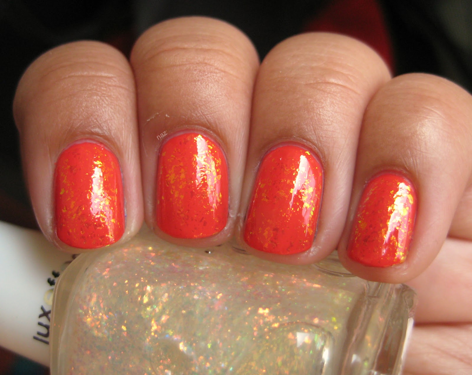
Since I can pretty much never leave cremes alone, I added a thin coat of Essie Shine of the Times. Some of these photos were taken before top coat, so some texture is visible, but it was perfectly smooth afterward.


It's a nice subtle look, but the flakies still show up nicely against the nude base.


There was practically no sun yesterday when I took these, but the sun came out for just a couple of minutes and I was able to take this shot. The flakies don't show up too well in direct sunlight, but on the bright side, I finally got an accurate depiction of the way Brooch the Subject looks against my skintone!


And here's the obligatory shot at an awkward angle to show the color shift:


Thanks for looking, and enjoy the rest of your weekend!

Tuesday, April 24, 2012

OPI The Show Must Go On

OPI The Show Must Go On was released with the Winter 2010 Burlesque collection. I couldn't care less about the movie, Cher, or Xtina (is she even relevant anymore?) but with that collection came some truly lovely shimmers. Aside from this, I picked up Tease-y Does It, which has become one of my favorites despite the horrendous, cringe-inducing name.


The Show Must Go On is an insanely vibrant pink-orange duochrome foil. It's almost opaque in 2 coats, but definitely needs the third one to make sure it's covered evenly. I am not a pink lover, but this is just awesome. The formula is pretty good. Nothing stellar, but definitely not bad either. Here it is in sunlight:


And in the shade:


The color shift doesn't show up too well in normal photos, so I took some at weird, awkward angles. It's a lot more visible in person.


It's so weird. I don't like pink, and I'm not big on orange either, yet I really like this color. Well played, OPI. Well played.

Thanks for looking!


Sunday, April 22, 2012

Sinful Colors Open Seas + Essie As Gold As It Gets

Sinful Colors Open Seas is a polish that I showed you back in December, but since my original photo isn't accurate and my nails were in pretty bad shape at the time, I figured I'd reswatch for this post. 3 thin coats, no top coat, artificial light.


The formula is thin but smooth, and it levels itself out nicely. I just can't seem to leave cremes alone though, so I decided to put a thin coat of Essie As Gold as it Gets on top.


I had my doubts about mint green and gold together, but I actually rather like the result. It's subtle, but really cool.


I know the Essie stands out more against dark colors, but I like it much better over lighter ones like this, or Essence What Do U Think.

Thanks for looking!

Wednesday, April 18, 2012

Essie Ole Caliente + Essie Shine of the Times

Essie Ole Caliente is part of Essie's Navigate Her collection for this spring. At first I was thinking "Meh, whatever. Boring." but then I saw the collection in person and realized how pretty it actually is! Most of the colors are terrible for my skintone, but Ole Caliente is gorgeous. I'm debating getting Navigate her too. Light greens are tricky for me, so we'll see how that goes. Anyway, here's Ole Caliente.


Essie cremes can be a little tricky and prone to patching (case in point: Pretty Edgy), but I found that Ole Caliente works best in 4 super-thin coats. I let them dry completely just to be on the safe side.


Mind you, this is without top coat! It's that glossy on its own. It dried quickly, and I didn't have any issues with running or pooling.


Coral is pretty far out of my comfort zone, and while I do really like this color, I'm just not used to pink/orange/coral on me, so it looked a little weird. I figured adding flakies would help. This is one thin coat of Shine of the Times over Ole Caliente:


Usually the flakes in Shine of the Times and its assorted dupes are more orange, but they looked yellow most of the time. It's not a bad thing, just unexpected.


I think all the yellow from the flakes made Ole Caliente look more orange overall? They did help though. Coral is a lot less weird on my hands when there's glitter or flakes involved.


I don't usually keep the same polish on for more than 2 days, but I wore this combination for four days, and it wore really well. Very minor tipwear on a few nails, and no chipping whatsoever.

Thanks for looking!

Wednesday, April 11, 2012

Sinful Colors Cinderella

Sinful Colors Cinderella is a milky light blue with pink flecks of shimmer. Usually with colors like this, the shimmer kind of disappears in the base and never looks as prominent as it does in the bottle. Not the case here!


Shimmerrrrr. It didn't really show up on camera, but trust me, it's a lot more prominent in person. I usually don't like normal pastels on me, because something about my skintone and the combination of light and bright...it just doesn't really work. I actually really liked this though!


It's so unique compared to all the other light blues out there! The only problem? The formula. Oh goodness, that formula. What you see here is five coats, no top coat. My base was a coat of Sally Hansen Miracle Nail Thickener, which is clear. A ridge-filling base coat probably would have helped, but regardless, five coats. And you can still see some of the nail line on my pinky and index finger. I let each coat dry completely to avoid bubbling, so as you can imagine, this manicure took a while. The formula was pretty thick, but manageable, and I like the Sinful Colors brush so it wasn't too bad. Five coats though...if you have a light blue like Illamasqua Caress or Sally Hansen Barracuda, I'd recommend using those as a base. 


That shimmer though! I guess that's the tradeoff. Sheer base, prominent shimmer. I'm not a huge fan of blue and pink together but it works really well here. A closer look:


Thanks for looking!

Monday, April 9, 2012

Chanel Peridot

Chanel Peridot was released as part of the Fall 2011 Illusions D'Ombres collection. There were two other polishes released along with it, Quartz and Graphite, but Quartz looks weird and frosty, and Graphite isn't all that interesting to me. Peridot, on the other hand, is AMAZING! I know a lot of people were disappointed with the lack of a clear blue color shift, but that doesn't bother me too much. In the bottle:


The blue is really clear along the edges of the bottle, but you can barely see it on the nail, and only at awkward angles.


You can kiiiiinda see it at the very edges there, but not too well. At an awkward angle:


It's slightly more visible at the edges there, but it's still not prominent at all. Peridot is gold, but it's a really yellow, almost green gold. At first, I declared it ugly and decided that it would turn my hands into lobster claws anyway, so why bother. A few weeks later, I saw it in person and changed my mind completely. This is my only Chanel, but I'm very very happy with it. I know brushstrokes are a pretty big concern, but they weren't an issue for me at all. They showed a little while wet, but it dried quickly and the brushstrokes disappeared almost completely, so now it just looks like metal. In direct sunlight:


Sunlight brings out the green in Peridot, and I usually hate light yellow-greens but this is just awesome. The formula is almost perfect. It took 3 coats, but that's the only flaw. Each coat applied smoothly and dried quickly. I didn't even have to clean up this manicure after painting! I wore it for four days, and got neither chipping nor tipwear. This is Top 20 material. Maybe even Top 10?


So yeah. Peridot is great. It's a shame Chanels are so expensive though. I think Ozotic Pro, Chemistry, Missha, and Peripera have dupes or near-dupes, and OPI has a dupe in their upcoming Spiderman collection, called Just Spotted the Lizard. Based on the promo pics, it looks like we've got a China Glaze dupe on our hands in their New Bohemian collection, but there aren't any swatches or official press releases yet.

Thanks for looking!

Thursday, April 5, 2012

OPI Lucerne-tainly Look Marvelous

OPI Lucerne-tainly Look Marvelous is from OPI's Fall 2010 Swiss collection. It's a gunmetal foil that's fully opaque in 3 coats. Under artificial light:


It's got a bit of a blue tinge to it, but that doesn't really show up all that much in other lighting situations.


Lucerne-tainly Look Marvelous isn't sparkly like most foils (eg. Orly Luxe, Orly Shine). It's a bit dull, but in an interesting way, not necessarily a bad way.


The formula and application are pretty good, despite the Pro-Wide brush.


Yeah. There's not a lot to say about this one. It's good, and it's fairly unique (I think), but it's not all that exciting, and nothing to write home about.

Thanks for looking!

Monday, April 2, 2012

Zoya Faye

Faye is from Zoya's Sunshine collection, the sparkly counterpart to the Summertime collection. It consists of gold foil-y flecks of sparkle in a dark pink/mauve base. Sounds weird, but it's actually really pretty. It's also identical to OPI Rally Pretty Pink and nearly identical to Orly Ingenue (which is the tiniest bit more purple). Here it is under artificial light:


Here you can see the base color really clearly, but in the shade, the gold is really prominent, and Faye looks coppery with pinkish edges.


Here's the bad news: Faye is super sheer. I used four coats for these photos, and you can still see my nail line in person, though I'm not sure just how visible it is in these photos. It could definitely use a fifth coat, which is kind of disappointing since Zoya has shown us several times how good they are with these foil/jelly-type colors. Just look at Ivanka and Charla! Those have a very similar finish, but they're good in 3 coats, not 5.


Yep, there's that visible nail line. Boo. I do still prefer this one to OPI Rally Pretty Pink, just because I hate the Pro-Wide brush. The Zoya brush is also a little tricky for me, but nowhere near as bad as that ridiculous mop that OPI provides for us. Still a lovely color though!

Thanks for looking!