Saturday, June 30, 2012

New York Summer Hot Sky Blue + Nails Inc. the Wyndham


New York Summer Hot Sky Blue is a medium blue jelly polish. Like most jellies, it's pretty thin and streaky, so I used four coats over one coat of Essie Fill the Gap.


It's pretty, but I'm not that crazy about it on its own, so I added Nails Inc. the Wyndham, which I loooove.


Much better! I think this would also work well for jelly sandwiches.

Thanks for looking and commenting!

Friday, June 29, 2012

Franken Friday #5, and some weirdness

Hurraaaaayyy, the week is finally over! Friday is almost over too but.........whatever.

Today's franken is one that I made several months ago, and have worn several times, but have never actually photographed until today. Whoops. It's nearly opaque in one coat, but I used 2 for good measure. It looks like a fairly uninteresting blue-grey shimmer in the shade.


In the light, however, it looks a lot more interesting. Blue, green, and silver bits of shimmer, and there's a bit of orange too, though that was pretty much impossible to capture.


A closer look at the shimmer:


I don't remember what exactly I used, but I know the shimmer is from Sally Hansen Mandarin Mantra, a very old sheer orange shimmer. If I recall, that one was only good for layering, and I'm not a big orange fan, so I used it up for this. I also used Revlon Royal for the blue part, and as a result, this franken smells horrendous. I don't know what it is about Royal, but it smells really...skunky. I think I also threw in some black or grey to darken it.

Now for the weirdness. Remember this franken that I made back in January? It's pretty clearly a blue-toned green, right? Well, not anymore. I pulled it out this morning, and well, this is what it looks like now.


It's still holo enough, but I'm really weirded out by the fact that it's so olive now. Unfortunately, olive doesn't seem to play too well with my skintone, but it's not that bad, I guess. And I could always add more blue to get it back to the way it was, but at any rate, it's something to keep an eye out for while frankening.

Thanks for looking and commenting, and have a great weekend!

Thursday, June 21, 2012

Illamasqua Rampage and Verity Aqua Blue

Lazy blogger is lazy....and also procrastinating :( Not looking forward to my presentation tomorrow...freakin' DNA sequencing, man.

Anyway, let's talk polish. I have no idea when Illamasqua Rampage was released, but whatever. This is my all-time favorite green. It's dark, but never black, and it's a jelly. Perfect in 3 coats. Squishy, glossy, jelly awesomeness.


In direct sunlight:


I'm pretty sure Rampage has a permanent spot in my Top 5. Illamasqua also has my favorite bottle design! Well, at least before they changed the bottles....they are not as nice and angular anymore. :(

On a slightly related note, once, I commented on someone else's blog post and said something about the bottle change...the blogger had no idea what I was talking about and was like "uhhhh ok" and she had bottles of both types featured in that post. Aaaawkwardddd.....

tl;dr this is the best green ever and if you like greens and/or jellies you need this

As for Verity Aqua Blue...I don't know much about Verity polish, but they caught my attention thanks to the lovely jyj and her swatches! Thanks to her, I got this green, and Deep Violet, which I will show you some other time.


Despite the name, as you can see, it's pretty clearly green. Similar to Rampage, but more blue-toned, and the formula is not as nice. This is 4 thin coats over a ridge filler. I do like Aqua Blue, but I think it'll be used more for tinting frankens.

Thanks for looking and commenting, and enjoy the rest of your week!

Saturday, June 16, 2012

Jumping on the Gradient Bandwagon...(and SHXW Sun Kissed)

AKA one of the few instances of nail art you will probably ever see here, lol. I knew going into it that sponging would be difficult, but jeez :| Nail art is just not my thing. Luckily, after 3 or 4 rounds of sponging (and a thick coat of Gelous afterward), I got this result:


I used 1 coat of Essie Ole Caliente for the base, and as you can see, SHXW Sun Kissed is the other color. In retrospect, I should have sponged the orange onto the tips rather than the base, because I can see a few spots around my eponychia where Ole Caliente is still visible...I also had issues with flooding, because I put too much polish on the sponge. Cleanup was a nightmare, but I think that's kind of to be expected. I wound up just picking off the excess polish in the shower.

Despite the difficulties, I can see why gradients are so popular right now! All the flaws you can see in the macro shots aren't visible from a normal distance, so it looks really cool in person. Kinda reminds me of some sort of fruity summery drink.

I've already shown you Ole Caliente, but here's a photo of Sun Kissed that I took a while ago, under artificial light. It's actually a lot more yellow-toned than you'd think based on my photo of the gradient.


The formula is...not good. It's really thin and watery, and needs 4 coats for opacity. It is very bright and fun though, and the drying time wasn't as bad as I was expecting.

Thanks for looking and commenting, and enjoy your weekend!

Thursday, June 14, 2012

Barry M Dusky Mauve + Revlon Perplex

Today I've got for you two alternatives to the lovely, but rather expensive Chanel Paradoxal.

According to Lacquerized, Barry M Dusky Mauve is pretty much an exact dupe for Paradoxal. The formula and application are both great, and Dusky Mauve is fully opaque in 2 coats.


And here is Revlon Perplex. Same thing, 2 coats for opacity, great application.


As similar as they do look, they're not completely the same. They are very close though, and unless you want a backup or just really like these sorts of colors, you probably don't need both.


As you can see, Perplex's shimmer is more prominent, and it also has more purple in its base. Dusky Mauve is more brownish. I know I'm a little late to the Paradoxal bandwagon/party but this type of color is one of my favorites when I need something that's less bright or in-your-face.

 Barry M is a UK drugstore brand, and I bought my bottle of Dusky Mauve on Ebay. If you'd rather not take your chances with Ebay, the etailer Harlow & Co. carries some Barry M, although I'm not entirely sure whether they've got Dusky Mauve. Revlon Perplex has been renamed Naughty, and is part of the new core line that includes Chic and Whimsical, so that one should be easily found at drugstores and such.

Thanks for looking and commenting! 

Friday, June 8, 2012

Franken Friday #4

Happy Friday!!! It's been a while since I posted a franken...just haven't gotten around to wearing 'em lately, I guess.


The Milani holos were my first foray into holographic polishes over a year ago, and I wound up with HD (the silver one) and Cyberspace (the blue one). HD is still my favorite of any silver holo out there, but I've also acquired OPI DS Sapphire and China Glaze 2NITE since then, and honestly, those are a lot more interesting than Cyberspace, so I figured I'd franken with it.


As you can see, there's no longer any trace of the holo, but I'm okay with that. I started with a 70% full bottle of Cyberspace, and the other 30% is Ruby Kisses Regaled Out Blue and Verity Aqua Blue in a roughly 2:1 ratio. The Milani holos have a very interesting type of shimmer- rather than normal particles, these are more like shards of shimmer. You can see it more closely here:


Pardon my weirdo thumbnail shape...I nicked it on something and was too lazy to file out the unevenness before taking this photo, lol.

Thanks for looking and commenting, and have a great weekend!

Monday, June 4, 2012

Revlon Runway Pearl

Every so often, Revlon puts out "trendy" colors in separate displays, like Perplex (later rereleased under the name Naughty) and Carbonite. This spring, we have Runway Pearl, but I have to admit I'm a little confused. Perplex and Carbonite are pretty clear knockoffs of Chanel Paradoxal and Chanel Graphite, respectively, and were released not long after the Chanels, but I can't tell what Runway Pearl is supposed to approximate. It looks sort of like Chanel Intermezzo, but Intermezzo is a frosty mess, and has pink, subtle shimmer. Either way, Runway Pearl is fantastic. In the shade:


As you can see, Revlon Runway Pearl is a soft white with contrasting shimmer. In the shade, the shimmer looks pinkish, but in direct light it's closer to red. I was worried that the shimmer would disappear in the shade or just not show up at all *cough*RBL*cough*, but that is not the case! By the time I got around to taking these photos, it was too late in the afternoon to get decent sunlight shots, so I used artificial light instead. Skyward Sword is so distracting :'D


The artificial light gives it a slightly yellowish/ivory cast which isn't there in person, but this was more for the purposes of depicting the shimmer. It looks so freaking cool! Wherever the light hits it, it gets this glowy pink sheen.


Shimmerrrrrr.

As far as formula goes, Runway Pearl wasn't too bad. I didn't apply any top coat before taking these photos, and I used 4 thin coats of Runway Pearl over 1 thin coat of Essie Fill the Gap for opacity. Yeah, it's a little sheer, but I think that's a good thing in this case, because otherwise it might have been too stark a white for me to pull off. This way, it's still a soft, but clean white. I did notice some patching near the cuticle end of my nails after the second coat, but I just let all subsequent coats dry completely, and it evened itself out. As usual, the brush was great, no complaints there.

Thanks for looking and commenting!

Saturday, June 2, 2012

SHCSM Petrol + LA Splash Midnight Rain

Petrol is one of the colors released as part of Sally Hansen's Spring 2012 collaboration with Alexander Wang. The brand also collaborated with Tracy Reese and Prabal Gurung, but none of those colors appealed to me. To be honest, Petrol was the only color that piqued my interest, and it wound up being quite a disappointment. See that nice, rich, dark navy blue in the bottle? See that ridiculous black color on my nails? I already have 2 bottles of black cremes, I did not need this :|


Lame. Super lame. Under artificial light (still lame):


Brush and formula are good, as usual. I'm probably going to dump out a bit and top it off with Essie Mesmerize or OPI Ski Teal We Drop to lighten it up a bit. Petrol in its natural state did, however, make a great base for LA Splash Midnight Rain!


Midnight Rain consists of small red and blue hex glitter (with the occasional odd piece of silver hex glitter) and superfine blue square glitter in a sheer navy base. I used 2 coats over Petrol, and no top coat. Most glitter polishes dry dull, but Midnight Rain is surprisingly glossy! I've been drooling over Midnight Rain for about a year now, and I randomly came across it at Harmon the other day. Unlike Petrol, Midnight Rain does not disappoint.


Man, I love glitter. I love the way the red glitter stands out against the blue. It's just awesome, and a welcome relief after the disappointments that are Petrol and Pinta.

Enjoy your weekend, and thanks for looking and commenting!

Friday, June 1, 2012

Zoya Pinta + Finger Paints Asylum

Happy Friday, everyone! Today I've got for you a combination that I wore a few days ago.


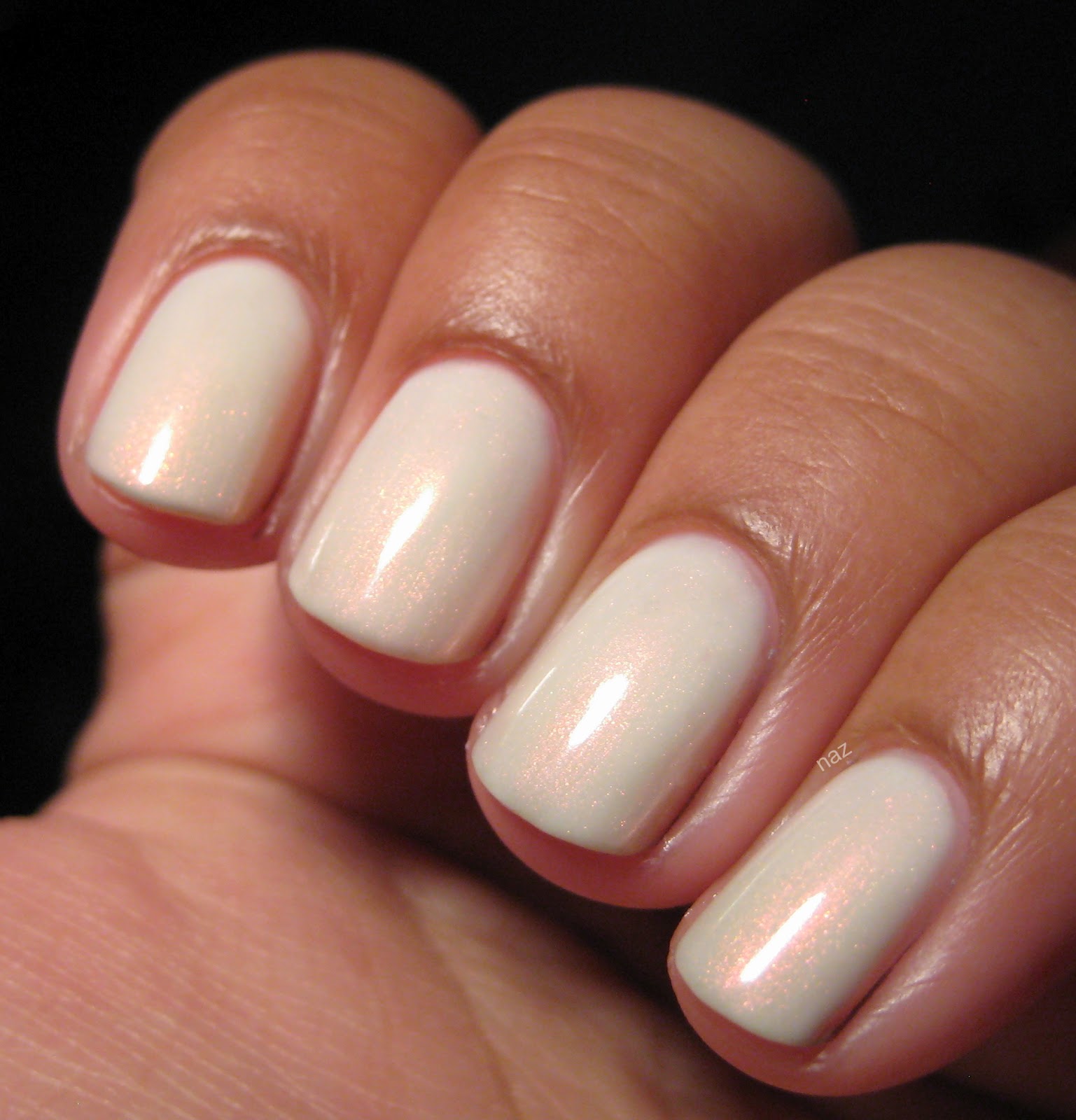
Zoya Pinta is a "blurple" creme from the Dare half of Zoya's Truth or Dare collection from Fall 2009. It's supposedly a dupe for the long-discontinued OPI Sapphire in the Snow, which I wanted for a while. It's definitely on the purple side, but there's enough blue in it that I can't call it a plain purple creme either. In direct sunlight:


See what I mean? It's not blue, but it's not purple either...I'm not usually a fan of random portmanteaus like that (or needlessly shortened words, for that matter), but it's just...blurple. Indigo doesn't really seem like the right word for it either, lol. Either way, it's a great color!


There is a "but" though, and it's a pretty big but. Heh, butt. I'm so mature. Anyway, the formula. The formula is awful. I've read on NB that Pinta is a smooth one-coater for many people, but I think I got a bad bottle or something, because the formula is just terrible. I know a lot of people have issues with Zoya's formula in general, but I have 6 or 7 Zoya polishes, and this is the first one to give me trouble. The rest are wonderful.

Pinta feels sticky, is super prone to dragging and pooling in my eponychia, and takes ages to dry. And then by the time it dries, it bubbles. I don't get it. Usually, with cremes and jellies, I'll wait for each coat to dry completely before the next to keep things as smooth as possible, but Pinta streaked anyway, so it needs anywhere from 3-4 coats to become fully opaque. Mind you, I took these photos immediately after applying top coat, so it looks nice and smooth and glossy here....

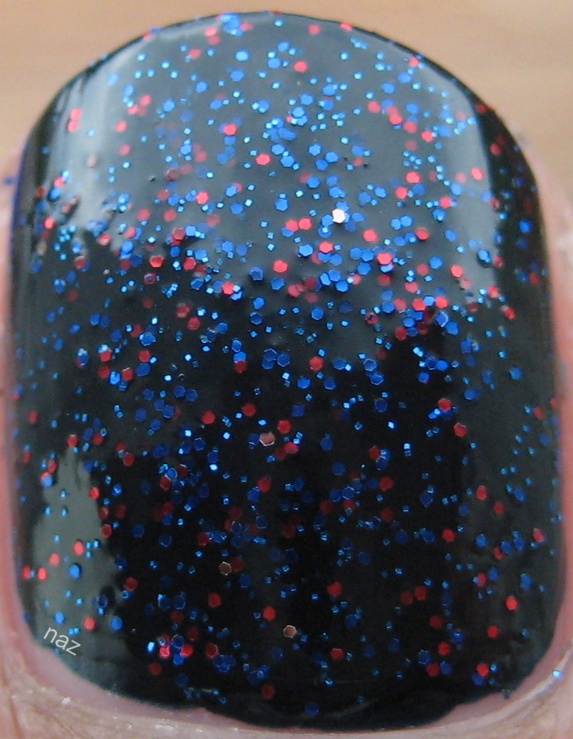
My top coat couldn't fully disguise the flaws in my mani, so I added a thick coat of Finger Paints Asylum, which did the trick.


The blue flakes in Asylum actually show up pretty well over top of Pinta! Yay flakies. They fix everything. In direct sunlight:


It was pretty late in the afternoon, which is why the sunlight photos are so warm, but aside from the freakish yellow tinge to my hands, they're fairly accurate depictions of the polish.

Have a great weekend, and I hope that everyone in areas with a Tornado Watch stays safe! I spent most of the day in the basement while it stormed, haha.